
The City Runs on Things Nobody Brags About
A city can launch another app, add another dashboard, and place another QR code beside a counter. Then the screen freezes, the rain arrives, the visitor takes the wrong lift, or the payment terminal decides that lunchtime is the correct moment for a small existential crisis.
The overlooked answer is not anti-technology. It is uncool city tech: signs, sheltered walkways, printed instructions, physical cards, temporary passes, human help desks, and one-page fallback plans. These things rarely get a launch video. They are also the reason many digital systems remain usable after the ideal path breaks.
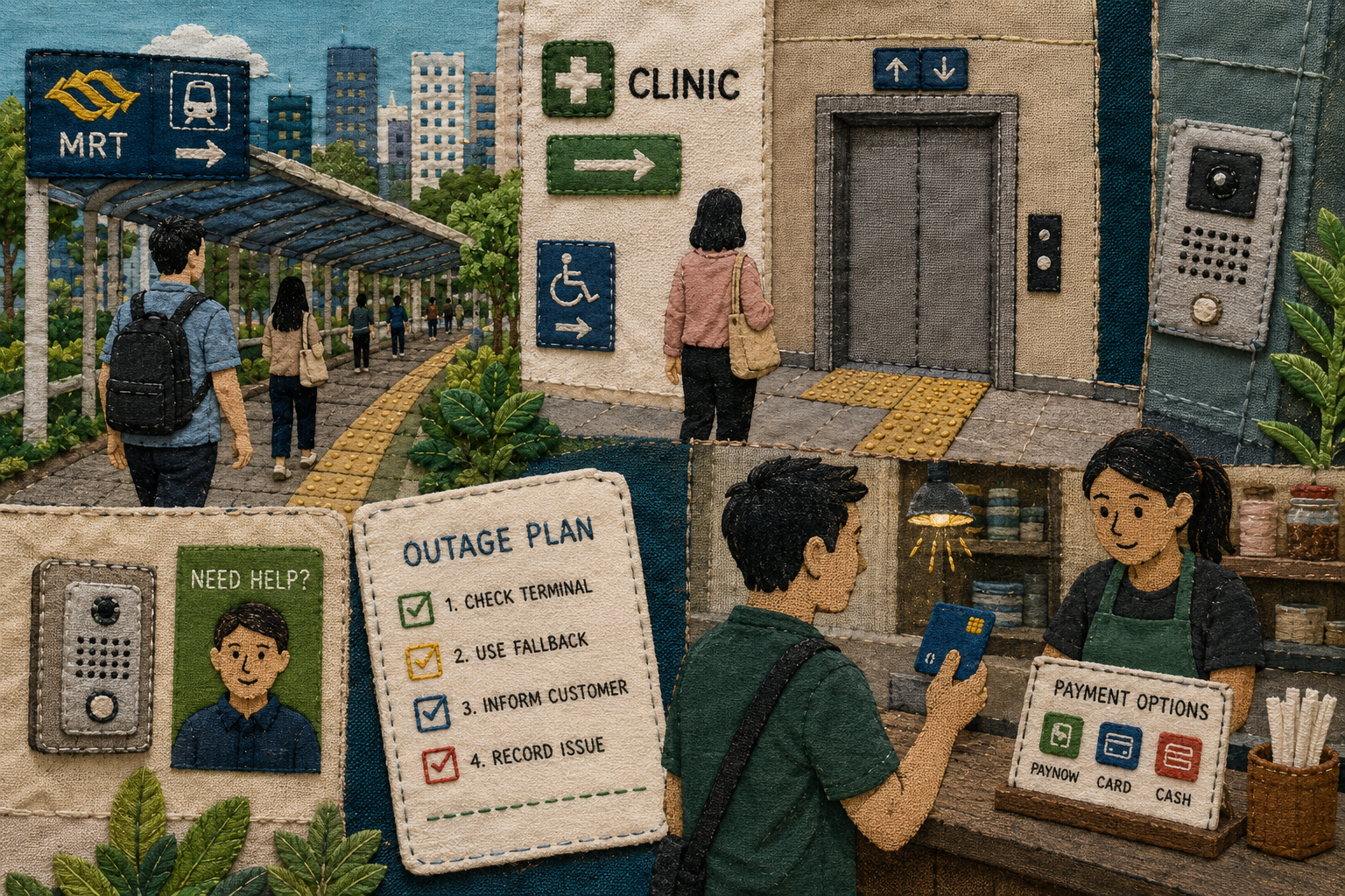
A Map of the Boring Things That Work
- The City Runs on Things Nobody Brags About
- The Boring Layer in One Minute
- Smart Systems Still Need a Physical Backup
- The Low-Tech Layer Is Not a Rejection of Technology
- Build a Five-Part Fallback Layer
- The Best City Interface Is Often the One You Barely Notice
- Frequently Asked Questions
- References
The Boring Layer in One Minute
- Main point: The best digital service still needs a visible fallback when the phone, network, route, or handoff stops behaving normally.
- What people often get wrong: Printed instructions, clear signs, and staffed counters are not evidence that a city failed to modernise.
- Why it matters: Small failures become larger when every task depends on one screen, one app, one entrance, or one payment path.
- Who should care: Residents, commuters, older relatives, small businesses, clinics, building managers, delivery riders, and service designers.
- Bottom line: The boring layer is not decoration. It is the part that keeps an ordinary day ordinary.
Smart Systems Still Need a Physical Backup
The fashionable city interface is a screen. It calculates a route, approves a payment, sends a parcel update, unlocks a door, or confirms an appointment. The less fashionable interface is a sign beside the correct lift.
The screen deserves attention. The sign deserves more respect.
Local transport planning already recognises that daily movement depends on physical details. In a 2024 announcement, the Land Transport Authority said it would improve first-and-last-mile connectivity with more commuter infrastructure. The planned improvements included senior-friendly bus-stop features, more covered linkways linking MRT stations with nearby amenities, and more lifts at pedestrian overhead bridges.
None of that sounds like science fiction. That is the point. A covered linkway does not replace a route-planning app. It makes the route usable when the rain starts. A lift does not compete with digital accessibility tools. It completes the journey that the tool recommended.
The Common Assumptions
- If an app exists, printed instructions are outdated.
- If a visitor has a map pin, the correct entrance will be obvious.
- If a shop accepts digital payments, a short outage plan is unnecessary.
- If a service is easy for regular users, first-time visitors will manage.
- If a fallback is low-tech, it must be temporary or inferior.
These assumptions confuse the ideal path with the real path. A system should be judged by what happens after the first surprise.
The Official Guidance Keeps Returning to Ordinary Things
The Building and Construction Authority's Universal Design Index treats accessibility and wayfinding as practical building features. Its examples include ramps, elevators, clear signage, and tactile guidance. That is a useful reminder: a building can contain the right facility and still fail when people cannot find it.
The Energy Market Authority's power-outage guidance for organisations is similarly grounded. It tells organisations to identify risks, prepare contingency plans, develop written procedures, keep emergency contacts available, conduct drills, and use checklists. A small shop does not need to turn that guidance into a 90-page binder. It does need a version staff can use when the till, lights, or internet stop cooperating.
IMDA's Digital for Life material makes the inclusion point from another direction. Digital participation is not only about devices and apps. Small acts such as helping someone learn a video call, fix a telehealth appointment, or access a useful service can matter. The human fallback is part of the system.
The 17:52 Mini Case
Picture an ordinary weekday evening.
A commuter leaves an MRT station while rain begins. The shortest walking route crosses an exposed section. The destination is a clinic inside a mixed-use building with two lift banks. The appointment reminder includes the address, but not the correct entrance. The visitor's phone battery is at 4%.
The most useful pieces of technology are suddenly modest:
- A sheltered walkway marker beside the station exit.
- A clear sign naming the clinic lift bank.
- A printed directory inside the lobby.
- A reception counter with a person who can answer one question.
- A phone battery that can now be saved for the journey home.
No single item is impressive. Together, they turn a fragile digital route into a workable physical one.
The Low-Tech Layer Is Not a Rejection of Technology
There is a lazy argument hiding inside some smart-city conversations: when a service still needs a sign, staff member, printed card, or physical backup, the digital transformation must be incomplete.
That argument misunderstands resilience.
A good fallback does not replace the main system. It handles the awkward edge cases the main system cannot eliminate. The goal is not preserving paper for nostalgic reasons. The goal is preventing a minor problem from becoming a queue, missed appointment, failed delivery, unsafe shortcut, or suspicious payment decision.
Where the Simple Take Fails
- A printed card can become outdated: Review it after a process, entrance, or contact number changes. A stale fallback is worse than a simple current one.
- Too many signs create another problem: Put the instruction at the decision point. Do not cover every wall in arrows and expect clarity to emerge from volume.
- Cash is not a universal answer: A physical card, modest cash amount, or temporary pause can be useful depending on the merchant and the outage. No single backup works everywhere.
- Human help is not an excuse for bad design: A reception counter can solve an edge case. It should not spend all day explaining the same preventable confusion.
- Apps still matter: Live transport information, digital payments, parcel tracking, and access tools can save time. The fallback exists because ordinary life does not stay inside the demo.
Compare the Quiet Fixes
| Quiet fix | Best for | Advantage | Limitation |
|---|---|---|---|
| Directional sign at the decision point | Station exits, lift banks, clinics, and mixed-use buildings | Solves the wrong turn before it happens | Needs precise wording and current placement |
| Printed one-page outage card | Cafés, salons, small shops, and service counters | Gives staff one routine when screens fail | Needs periodic review and a safe stop rule |
| Physical card or modest cash fallback | Short payment interruptions during ordinary errands | Reduces dependence on one phone or app | Merchant acceptance and network conditions vary |
| Expiring visitor pass or intercom fallback | One-time building visits | Avoids forcing every visitor into a permanent app account | Must still follow building rules |
| Staffed help point or public contact number | Clinics, buildings, and community services | Handles the exception a sign cannot predict | Should not replace clearer design |
| Sheltered or barrier-free route cue | Rain, prams, trolleys, and mobility needs | Makes the practical route visible | Requires maintenance and on-the-ground accuracy |
The best option is often a pair: the app for speed, the physical cue for certainty.
What Not to Do
Do not make a visitor install an app for a one-time visit when a temporary pass works. Do not hide the accessible entrance behind an unlabelled detour. Do not tell staff to improvise payment instructions during an outage. Do not use a QR code as a substitute for the plain sentence a person needs before the wrong turn.
Most of all, do not remove a working fallback merely because it looks unfashionable beside the new system.
Build a Five-Part Fallback Layer
A useful fallback audit takes 15 minutes. It works for a clinic, café, neighbourhood shop, office, flat, event venue, or community service.
Walk through one ordinary task from the perspective of a first-time visitor. Start outside. End only when the person has completed the handoff.
The Five-Part Audit
- Arrival: Can a person identify the correct entrance, station exit, or drop-off point without calling?
- Direction: Does the useful instruction appear before the corridor, crossing, or lift-bank split?
- Transaction: Is there one approved fallback when a terminal, app, or internet connection fails?
- Access: Can a visitor, older relative, delivery rider, or person with a trolley complete the route without an unexplained detour?
- Recovery: When the main system returns, does somebody confirm that the process is working before normal service resumes?
The audit does not require a redesign. It requires attention to the point where a reasonable person stops knowing what to do next.
The Small-Business Version
A small business can complete the first pass before the next lunch rush:
- Add the correct entrance and lift bank to appointment or delivery messages.
- Place one visible sign before the confusing turn.
- Print a ten-minute outage card for the counter.
- Keep one public-facing contact number current.
- Test the arrival route during rain or a busy period.
- Review temporary signs, QR stands, and fallback instructions once a month.
- Remove instructions that no longer match the real route.
The Building-Manager Version
A building manager has a slightly different checklist:
- Walk the visitor route from the public entrance.
- Confirm that accessible routes are visible and usable.
- Use temporary visitor access for temporary visits where appropriate.
- Review whether a staffed or intercom fallback exists.
- Check that old notices and old access instructions are removed.
- Ask one first-time visitor to test the route.
- Fix the first point of doubt before adding another screen.
The Resident Version
Residents can do less and still make a difference:
- Save the useful station exit for a regular destination.
- Keep one physical payment fallback for ordinary errands.
- Write delivery notes from the rider's entrance, not the resident's shortcut.
- Avoid sharing private access codes publicly.
- Help an older relative simplify the first phone screen instead of adding more icons.
- Step aside when a payment or parcel message becomes strange.
The Best City Interface Is Often the One You Barely Notice
A city does not become less digital when it keeps the boring layer. It becomes more usable.
The covered walkway matters because rain exists. The sign matters because map pins stop at walls. The printed card matters because screens fail. The human fallback matters because not every person arrives with the same battery, mobility, language, confidence, or familiarity.
Keep the clever tools. Then walk the route after the clever tool stops helping. That is where the uncool tech earns its place.
Frequently Asked Questions
Q1. What counts as uncool city tech?
It includes practical systems that rarely attract attention: directional signs, sheltered-route markers, printed procedures, physical payment backups, temporary passes, public contact numbers, directories, intercoms, and staffed help points. The common feature is simple: each one helps when the ideal digital path breaks.
Q2. Does keeping a printed fallback mean a business should avoid apps?
No. A fallback should support the main digital process, not replace it. A shop may rely on digital payments and still keep a one-page outage routine so staff know what to do during a short interruption.
Q3. How often should a small business review its fallback instructions?
Review them after any entrance, process, contact-number, payment, or access-policy change. A short monthly check is useful for counter cards, temporary signs, QR stands, public contact numbers, and delivery instructions.
Q4. Where should a wayfinding sign go?
Place it before the first realistic wrong turn. A sign beside the final destination may confirm arrival, but it cannot prevent confusion at the earlier split between entrances, corridors, crossings, or lift banks.
By: Rex Iriarte
Why trust this: This post uses current transport, outage-readiness, accessibility, and digital-inclusion guidance to examine the overlooked physical layer beneath city technology.
Last updated: 2026-06-02
Disclosure: No paid placement influenced this post.
References
- Land Transport Authority — “Additional $1 Billion to Encourage More Walk Cycle Ride Journeys” (2024). https://www.lta.gov.sg/content/ltagov/en/newsroom/2024/3/news-releases/additional_1b_to_encourage_more_wcr_journeys.html
- Energy Market Authority — “Organisations: Power Outage Readiness” (2025). https://www.ema.gov.sg/consumer-information/electricity/power-outage-readiness/organisations
- Building and Construction Authority — “Universal Design Performance” (updated 2026). https://www1.bca.gov.sg/home-and-building-owners/accessibility-and-universal-design/universal-design-performance/
- Infocomm Media Development Authority — “Digital for Life” (updated 2026). https://www.imda.gov.sg/about-imda/who-we-are/digital-for-life




0 Comments