
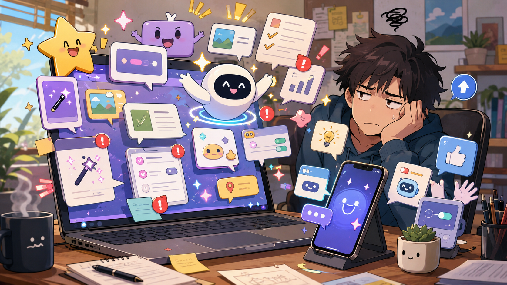
The Button That Appeared Overnight and Wants Gratitude
Every new tech feature arrives with the emotional energy of someone holding the door open from 40 feet away. You did not ask. They are already committed. Now you have to jog awkwardly and pretend this was helpful.
One day your app looks normal. The next day there is a new button, a new sidebar, a new assistant, a new “for you” panel, or a cheerful prompt that seems convinced it has just rescued you from the primitive burden of clicking things yourself. The feature is not merely present. It is proud.
That is the comedy of modern software. New tech features often act like gifts, even when they are chores wearing confetti. Sometimes they save time. Sometimes they rearrange your habits for the benefit of a product roadmap you never voted for. Dios mío, sometimes the new button is just there, glowing like it pays rent.
The Uninvited Feature Survival Map
- The Button That Appeared Overnight and Wants Gratitude
- Quick Take Before the Update Congratulates Itself
- The Feature Arrives First, the Explanation Arrives Later
- Helpful Is Not the Same as Wanted
- How to Handle New Features Without Starting a Tiny War
- FAQ: New Tech Features Nobody Asked For
- References
Quick Take Before the Update Congratulates Itself
- Core claim: New features are not bad by default, but they often arrive with too much confidence and not enough explanation.
- What people usually get wrong: They assume the only choices are “accept everything” or “become a cabin hermit with a flip phone.”
- Why it matters: New buttons can change privacy settings, workflows, storage use, notifications, search behavior, and daily habits.
- Who this affects: Anyone who opened an app for one simple task and got greeted by a feature tour with the spiritual weight of jury duty.
- Bottom-line opinion: Treat new features like interns. Be polite, test the useful ones, and do not hand them the keys on day one.
The Feature Arrives First, the Explanation Arrives Later
Software companies love announcing new features as if everyone had been waiting by the window with soup. The language is always generous: easier, smarter, faster, more personal, more seamless. Nobody says, “We moved the button because a committee had strong feelings.” They say the experience is now improved.
Sometimes it really is improved. Apple’s iOS updates regularly bring new design changes, intelligent experiences, app improvements, and controls. Microsoft describes Copilot on Windows as a built-in assistant experience on many new Windows 11 PCs. Google’s AI Mode frames search as a more conversational, follow-up-friendly experience. These are not imaginary shifts. The major platforms are actively adding more assistance, more prediction, and more automation into ordinary software.
The issue is not that technology changes. The issue is that the user is often treated like the last person invited to the meeting. The feature appears, the interface shifts, the old habit breaks, and the user is expected to admire the ambition while hunting for the setting that moved behind three menus and a tiny gear icon.
The myths these updates quietly sell
- “New means better.”
- “Visible means useful.”
- “Default means recommended for everyone.”
- “AI means smarter, not just more complicated.”
- “You will appreciate this once you stop asking where the old button went.”
What the real pattern suggests
The current pattern is simple: platforms want software to do more before users ask. Search wants to answer before you click. Office apps want to draft before you write. Phones want to suggest before you decide. Browsers want to summarize before you finish reading. Operating systems want to surface, predict, and organize more of the day.
That creates real benefits. It can reduce repetitive steps. It can help users understand dense pages, locate files, summarize text, or automate boring tasks. But it also creates an expectation that every product should now hover helpfully in the background like a butler who has read your diary.
The best features disappear into the task. The worst ones interrupt the task to introduce themselves.
A normal update-day scenario
Imagine a person opening their laptop at 8:20 a.m. They need to answer one email, download one file, and join a 9:00 meeting. Simple. Respectable. Very adult.
Then the app opens with a new side panel. The browser has a new assistant icon. The document editor wants to summarize a document nobody asked it to summarize. The search bar looks different. The phone has a prompt about a new “helpful” experience. Somewhere, a badge says “Try it now,” which is software language for “we added a chore and dressed it like dessert.”
By 8:37 a.m., nothing is broken. That is the annoying part. Everything technically works. It just feels like the furniture moved while you were sleeping.
Helpful Is Not the Same as Wanted
A feature can be useful and still be unwelcome in the moment. That is the nuance software marketing often skips. If you are trying to pay a bill, you do not want a tour. If you are opening a document during a meeting, you do not want the app to audition for a productivity award. If you are searching for a simple answer, you may not want the entire internet blended into a confident paragraph.
Good timing matters. A new feature that appears during setup feels optional. A new feature that appears during a deadline feels like a tiny ambush. The same tool can feel helpful on Saturday and deeply disrespectful on Monday morning at 8:59.
There is also the trust issue. New features increasingly depend on personalization, cloud processing, account settings, app permissions, or AI-assisted interpretation. That does not make them automatically bad. It does mean users deserve clear explanations and easy controls. If the product needs more context to help, it should be honest about what it uses and how to turn it off.
Where the simple take fails
- “Just ignore it”: Some features change layouts, defaults, notifications, or workflows even if you never click them.
- “Just use it”: Not every new tool deserves access to your habits, documents, screen, or patience.
- “It is only a button”: Buttons shape behavior. A pinned feature is a suggestion with furniture.
- “Updates are always progress”: Progress for the company and progress for the user are cousins, not twins.
What not to do
Do not rage-click through every prompt just to make it disappear. That is how you accidentally agree to a feature, enable a sync setting, start a trial, or turn on the digital equivalent of a parrot that lives in your sidebar.
Also do not assume every new feature is useless. Some are quietly excellent after you tame them. The trick is to test with low-stakes tasks first. Let the feature summarize a public help page before you let it near work documents. Let it suggest a grocery list before you let it organize serious files. Make it earn trust in the kiddie pool.
How to Handle New Features Without Starting a Tiny War
The practical response is a 10-minute feature audit. Not dramatic. Not spiritual. Just useful.
When a new feature appears, ask three questions: What does it change? What data or permission does it need? Can I turn it off, hide it, or limit it? If the answer is unclear, do not adopt it during a busy moment. Make a note, finish the task, then check settings later when your blood pressure is not being sponsored by a pop-up.
For AI-related features, be stricter. Look for settings around personalization, connected experiences, history, content analysis, cloud processing, and app access. Microsoft support pages, for example, show that some Copilot experiences can be enabled or disabled through app settings, privacy settings, or installed-app controls depending on the product. Apple and Google also publish support pages for managing newer intelligent features and suggestion controls. The settings exist because control matters.
Quick reality-check list
- Before clicking “Try,” ask what problem this feature actually solves for you.
- Check whether it changes defaults, notifications, search behavior, privacy settings, or saved history.
- Test it on low-stakes content first, not private files or urgent work.
- Hide, unpin, or disable features that add clutter without saving time.
- Recheck settings after major updates, especially for AI, assistant, search, and personalization tools.
- Give useful features a fair test, but do not confuse novelty with value.
A small rule helps: if a feature saves you at least 30 seconds repeatedly without creating new cleanup, it may deserve a place. If it saves 3 seconds once but adds a glowing button forever, it is not a feature. It is a decorative tax.
Feature triage table
| New feature behavior | Best response | Why it helps | Watch out for |
|---|---|---|---|
| Saves repeated clicks | Keep it and customize it | Reduces friction without drama | Make sure it does not add notifications |
| Adds AI help to writing or search | Test it on low-risk tasks | Lets you judge accuracy and usefulness | Do not feed it sensitive content casually |
| Changes layout or navigation | Give it one week, then decide | Some layout changes need adjustment time | Do not waste time fighting muscle memory forever |
| Adds pop-ups, badges, or prompts | Disable or quiet it | Reduces interruption fatigue | Some controls may be hidden in app settings |
| Requires broad permissions | Pause before enabling | Prevents accidental over-sharing | Check privacy and account settings first |
The Best Features Do Not Need a Parade
The best new tech feature is not the loudest one. It is the one you stop noticing because it actually made the task easier. It does not ask for applause. It does not pin itself to the taskbar with a tiny trumpet. It just removes a little friction and goes home.
The worst new features act like they did you a favor by existing. They arrive early, explain late, and make the user do the emotional labor of figuring out whether the “improvement” improved anything. That is why a skeptical pause is healthy.
Let new features audition. Keep the ones that help. Mute the ones that interrupt. And when a fresh button appears overnight acting like it personally carried your laptop across a river, remember: you are allowed to say, “Gracias, but no.”
FAQ: New Tech Features Nobody Asked For
Q1. Should I turn off every new tech feature right away?
A1. No. Some new features are genuinely useful after a short test. The better habit is to test them with low-stakes tasks, check their settings, and keep only the ones that save time without adding clutter or privacy concerns.
Q2. Why do apps keep adding features I did not request?
A2. Apps compete for attention, retention, automation, and platform relevance. That often means companies add features that support product strategy before every user clearly needs them. Your job is not to accept the whole roadmap. Your job is to decide what helps your actual day.
Q3. What is the fastest way to judge a new feature?
A3. Ask whether it saves repeated effort, respects your settings, and stays out of the way when not needed. If it interrupts more than it helps, hide it, disable it, or leave it unused until it proves itself.
By: Andrew Eyes
Why trust this: This commentary uses current official feature pages, consumer-facing support examples, and practical settings guidance without claiming insider access.
Last updated: 2026-05-20
Disclosure: No paid placement influenced this post.
References
- Apple Support: “About iOS 26 Updates” (accessed 2026-05-20). https://support.apple.com/en-us/123075
Supports the discussion of major operating-system updates adding design changes, intelligent experiences, and app improvements. - Microsoft Support: “Getting started with Copilot on Windows” (accessed 2026-05-20). https://support.microsoft.com/en-au/topic/getting-started-with-copilot-on-windows-1159c61f-86c3-4755-bf83-7fbff7e0982d
Supports the discussion of Copilot appearing as a built-in Windows experience on many new Windows 11 PCs. - Google Search Help: “Get AI-powered responses with AI Mode in Google Search” (accessed 2026-05-20). https://support.google.com/websearch/answer/16011537
Supports the discussion of AI search becoming more conversational and follow-up driven. - NIST: “AI Risk Management Framework” (accessed 2026-05-20). https://www.nist.gov/itl/ai-risk-management-framework
Provides broader context for managing AI-related risks, including trust, privacy, and user impact.


